Categories
Fonts

Neo Sans Font

Neo Sans was released by Monotype Corporation and was designed by Sebastian Lester in 2004. The concept of the design is advanced and futuristic while not expressing too much gimmick and drama. Lester describes it as readable without being neutral, and communicative without being distractive. However, due to bureaucratic decision of cancelling the design, the project didn’t push through. But this didn’t stop Lester in completing the project. Just after a year, Neo Sans and Neo Tech emerged.

Neo Sans showcases some rounded, square sans letterforms with six weights extending from light to ultra with italics. It is perfect for editorial and publication design. Due to its modern textures, many successful companies such as KIA Motors and UK ITV used it for advertising. Neo Sans can support up to 89 languages.

Download Neo Sans Font

Categories
Fonts

Modesto Font

Modesto was started in 2000 by Jim Parkinson. It was based from signpainters lettering style famous during the 19th to 20th centuries.  Its family was not planned but it later on emerge into a huge typeface family with three weights and a lower case.

Evolving from a few fonts at a time for over fifteen years, Modesto has now 11 typefaces such as Condensed Light, Condensed, Condensed Bold, Expanded Regular, Expanded Italic, Lite Regular, Lite Italic, Light Expanded Regular, Light Expanded Italic, Poster Regular, and Poster Italic. It also supports up to 50 languages. Those Italic fonts were added in 2014. In addition, Modesto licenses are available in all styles.

Download Modesto Font

Categories
Fonts

FF Avance Font

FF Avance they say is a mysterious font because up until now, its origin is not known. However, in 2000, Dutch designer Evert Bloemsma created the serif FontFont which includes it. FF Avance has four typefaces which are Regular, Italic, Bold, and Bold Italic and it supports at least 21 languages.

FF Avance brings front-line support features such as fractions, case sensitive forms, super and subscript characters, and stylistic alternates. It also comes with oldstyle and lining figures. This serif stresses dynamic motion and direction of reading that is why it is commonly used in automobile industry. The asymmetrical serifs in upright styles makes it look in Italic. FF Avance is also ideal for editorial and publishing, book text, small text, and web design.

Download FF Avance Font

Categories
Fonts

FF DIN Font

FF DIN was designed by Dutch designer Albert-Jan Pool sometime in 1995 and 2009. This sans FontFont was first used to recognize railroad cars in Germany, and eventually on Germany’s public administration and signage. The family has 20 typefaces in normal and condensed styles, and even in italics. FF DIN delivers advanced support features such as fractions, case sensitive forms, super and subscript characters, and stylistic alternates. In addition, FF DIN has proportional lining and tabular lining for an across-the-board figure set options. This font is also made available in 51 languages including Cyrillic and Greek writing systems.

Nowadays, FF DIN is being used on highways signs, digital industries, logo, advertising, publishing and editorial, posters, billboards, and web and screen designs. FF DIN is among the 23 fonts added to the MoMA Architecture and Design Collection in New York in 2011.

FF DIN is the 3rd bestselling font today.


Download FF DIN Font

Categories
Fonts

Sackers Gothic Font

Sackers Gothic was designed by Monotype Design Studio in the early 90’s. It is one of the Sacker series based from the Roman letters which were the fonts used for invitation cards and engraved stationary. Since it is an engraver, small letters are not available in this family. Sackers Gothic contains up to 3 typefaces and supports at least 21 languages and 5 OpenType features.  The letters have contrast between thin and strong strokes. Furthermore, Sackers Gothic’s licenses are available in all styles.

Sackers Gothic is remarkably adaptable to book covers, logo, posters, social messages, and many others.

Download Sackers Gothic Font

Categories
Fonts

FF Blur Font

FF Blur was an experimental sans serif in 1992 by British designer Neville Brody. The designer started it by blurring a grotesque in Adobe Photoshop and later on develop it from making its results into vectors. The family includes Light, Medium and Bold weights and supports alternate characters, case sensitive forms, and ligatures. It also supports up to 50 languages and 5 OpenType features. In addition, FF Blur has proportional lining and tabular lining.

In 2011, FF Blur was included in the Museum of Modern Art’s in New York. Out of the 23 designs, FF Blur was permanently added in their collection.

Download FF Blur Font

Categories
Fonts

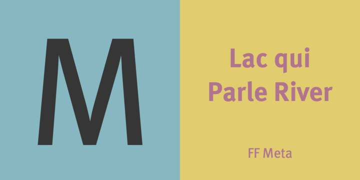
FF Meta Font

Erik Spiekermann is the founder of FF Meta which is actually the backbone of the FontFont library. During the computer era, FF Meta was widely used in almost everything that’s why it quickly became so popular. It was then called “The Helvetica of the 90’s. For more than two decades, the FF Meta family has added eight weights and two widths.  Following its success, the FF Meta Correspondence, FF Meta Serif, and FF Meta Headline among others, were also included.

FF Meta is perfect for branding, advertising, book text, editorial, publishing, screen design, logo, and so much more. It comes with digital old-style figures, and features small caps, case-sensitive forms, alternate characters, and fractions.

In 2011, FF Meta was permanently added to the MoMA Architecture and Design Collection in New York.

Download FF Meta Font

Categories
Fonts

Frutiger Font

Frutiger font began when Adrian Frutiger in 1968 was tasked to create a design for an airport signage and directional system which was then called Airport Roissy and was later on changed to Charles de Gaulle Airport in Paris. Many believed that Frutiger will follow the success of his own Univers font in making this signage, however he decided to make a new sans serif typeface which is a bit bolder than the original to better the letters and characters especially in dark places where lighting is poor or when readers are quickly passing by the airport, either driving or walking.

Unlike with the other font families, Frutiger is not geometrically based. It was created for readers to easily recognize and understand the characters that’s why it is ideal for signages and display work. While Frutiger was first introduced to airport due to the large-scale requirement, it was then used in many magazines and books wherein smaller scale of body text was also made available.

Frutiger remains on the 27th bestseller spot.


Download Frutiger Font

Categories
Fonts

ITC Lubalin Graph Font

ITC Lubalin Graph is originally based from ITC Avant Garde Gothic. It was designed in 1974 by Herb Lubalin, and drawn by Tony DiSpigna and Joe Sundwall. The first ITC has basic geometric character shapes while the latter has strong typeface and with additional slab serifs or Egyptian. Slabs are big squares or rectangles. ITC Lubalin Graph conveys a bold, straightforward appearance type from headlines to packaging. In 1992, small caps and old styles were added by Sigrid Engelmann and Helga Jorgenson.

This ITC Lubalin Graph is for use on a desktop workstation.  It supports up to 50 languages and 10 OpenType features. It is ideal for users who wish to portray practicality and steadiness.

Download ITC Lubalin Graph Font

Categories
Fonts

Univers Font

Univers is one of the bestseller fonts nowadays; making it to the 17th spot. It is designed by Adrian Frutiger in early 50’s. Frutiger focused on all the elements of this series from extra condensed to extended design and its color spectrum. He was also particular with giving out a uniform series by detailing the central designs. The Linoype version of Univers has uniform color across the series which differs it from the Monotype version with altered character widths. Univers is available for desktop, App, Webfont, ePub, server, and Digital Ads.

Univers is considered to be one of the best font discoveries in the 20th century because of its solid and thorough form. The FedEx company logo is a proof to that.


Download Univers Font