Categories
Fonts

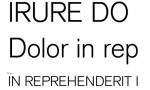
Bembo Font

This font dates back during the Italian Renaissance, particularly during the time of the famous Aldus Manutius printers. The latter made used of a new typeface in printing Book de Aetna by Pietro Bembo.

Francesco Griffo was the genius behind the Bembo font. The type dsigner was a known punchcutter who initiated the pen-drawn effect in humanist calligraphy. Such heavier look was made to develop a more stylistic visual that is commonly used in most roman font types these days. The introduction of the type design was made in 1929 when Stanley Morison and its Monotype Corporation design folks made used of Griffo’s design for its revival type. It was during the same time when it was named as “Bembo.”

Thereafter, a lot of changes were made to the letters to make the font more updated with the times. For instance, the creation of the italic type based on Giovanni Tagliente.

Bembo became a famous choice in the book typography because of its graceful and lighter weight stability. Its heavier weight versions share a conservative yet dependable effect for both advertising and packaging use.

To date, Bembo has 31 weights, inclusive of the following, Old style characters, small caps, expert figures plus a cap R alternate. Indeed, this font makes it an ideal, all-purport typeface family.
Download Bembo Font

Categories
Fonts

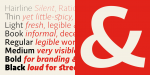
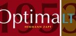
Optima Font

This typeface is a Hermann Zapf designed font and is considered the most successful of its kind of all. Optima’s first sketches dates back as early as 1950 when its designer was in Florence, visiting the church of Santa Croce. He started to sketch the letters from plates of the grave that has already been cut as early as 1530. He had to do this as there was no available paper at that time hence, he had to do this at bank notes of 1000 lire each. These letters inspired the creation of Optima, which eventually became a typeface inspired by classic Roman characters minus the serifs proportionately in Golden Ratio proportions. Because of the intricateness of the process, the first drawings were only finished in 1952. The careful legibility of the type paved the way for August Rosenberger, a famous punchcutter, to cut the said letters.

Optima was officially released in 1958 in matrice production for the Linotype machines. Since then it became a popular font option around the globe because of its clear, simple, elegant and purely human touches. It has been applied in sorts of purposes—from signage to book texts—you can find it. Optima is available 4 companion and 12 weight fonts.

Download Optima Font

Categories
Fonts

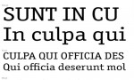
ITC Officina Serif Font

The font was initially released in the year 1990. It was paired with other serif family typefaces and was intended for correspondence in the business workforce. ITC Officina Serif is a typeface proven popular in different areas. It was designed by Erik Spiekermann to exemplify coolness and be chosen by trendsetters for their office purposes. Once this font is chosen, it will be able to denote a trendsetter’s coolness and had lost its unique innocence. No need to pretend anymore that its correspondence has two available weights. As a new face in magazines and ads, it entails proper headline and a diversion between bold and book weights. Should you wish additional weights and small letter size, ITC Officina’s creator collaborated with the director of Meta Design Ole Schaefer for more typographry and type design options. This resulted to more weights which include the Medium, Black and Extra Bold plus matching italics that are of Serif and Sans family. On top of that are the all new fonts for small caps weights for both Book and Bold.

Your business text has never experience such innovation, only with ITC Officina Serif. Bring a different glow into your message. Upgrade it to the next level.

Download ITC Officina Serif Font

Categories
Fonts

Basic Commercial Font

Basic Commercial was first released in 1900 with elements based on fonts from yesteryears particularly the hot metal font type era. The designers created this typeface in such a way that users cannot overlook the uniqueness it will bring to the material when applied. As a matter of fact, it has been popular in Dadaism, Bauhaus and the typography masters of International-Style and Swiss. Since its inception, Basic Commercial has influenced a variety of grotesque fonts, including Univers and Helvetica. The font was then distributed in the US by Standard Series and worked its way through the lives of different culture every day. In fact, NYC’s subway system used the font for its signage.

For its design, the font is very objective and clear. It exhibits nothing unusual but nonetheless it remains both legible and lively in the eyes of popular graphic designers. For decades, this type family has offered several weights and have been available versions that are soft-rounded.

Basic Commercial is available in 8 different styles. It supports a hundred of languages like Spanish, Portuguese, English, French, and German in Latin scripts, which all formats can be availed of. The price for this font starts at $45 for single style and $251 for its packages.

Download Basic Commercial Font

Categories
Fonts

Quercus Font

Looking for trendy old classic fonts? Why not try Quercus. Quercus gives a formal look to your work text. It is best for offices and formal presentation. Quercus makes your headings look prim and proper. Quercus has this thick weight which will give good emphasis to your headings because the letters do not attach with each other. Quercus can also be advisable to your texts since the small size of your texts will tend to be condensed, so by using this font the problem will be solved by providing little condensation of letters. Quercus is used in any types of work and is suitable to any papers, and also to any kinds of web designs. This particular font is recommended for making banners, streamers and posters and book covers and is compatible to any color used.

Quercus is created by Frantisek Storm. He inspired himself with the old classicist typefaces to create this serif font. This font is distinguished by an open, but also slightly condensed style in order not to compress with one another.

The font comes with a pack of eight interpolated weights with its respective italicized letters. With the package costing $329, although expensive but you will experience satisfaction since the package includes huge combinations where you can freely choose from Quercus Ten to any other Quercus typefaces.

Download Quercus Font

Categories
Fonts

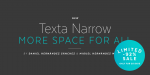
Texta Narrow Font

Not enough space for your work text? Use Texta Narrow where there is “more space for all”.

Texta Narrow belongs to the family of sans serif fonts. It is widely used by many and is up to the trend of modern fonts. This particular font is rational and transparent. Texta Narrow provides legibility and formality to texts which require long explanations or simply long texts. Texta Narrow is suitable to any type of office work such as presentations and proposals. From headings to long paragraphs, there is no problem at all; it is easily accessible to compose all kinds of texts.

Daniel Hernández Sánchez and Miguel Hernández Montoya designed Texta Narrow to save space thus they came up with a motto “more space for all” which led to the creation of this font. A lengthy work text needs more space to fit all those thoughts inside of your head that gives freedom for the work load.

As the name implies, the narrow design of the strokes of this font gives a fine detail of letters that can be easily read. Texta Narrow seems to solve all problems associated with space. Why not try Texta Narrow now, usually sold for $239. The narrower the better, the more space the more words can be expressed thus making the overall available space in the work increase.

Download Texta Narrow Font

Categories
Fonts

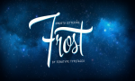
Frost Font

Are you thinking of fonts for headings that suit the trends of 2015? Headings are made perfect by Frost. Frost is a family series of fonts by Fenotype typefaces designed with versatility of style and sophistication thus making it compatible to all kinds of work; for banners and streamers, most especially for headings. The style of Frost will give emphasis to your captions and titles that will supplement any other fonts of texts. The font is smooth, very polished, regular and linear therefore one must try this font design.

In 1950s and 1960s, Emil Karl Bertell, a Finnish type designer and illustrator created Frost under the influence of hand-letterings and sign painting styles. The creation of Frost has lead to the rise of other font designs but there is no other font than Frost alone. The series of this font contains the script that varies in three different weights which are thin than wide.

Since making your own hand-written lettering consumes ample amount of time and requires great effort. A little touch of Frost font will do the work on your headings. This font includes useful ornaments and banner sets, caps and small caps – unlock these features and experience Frost at $69 only.

Download Frost Font

Categories
Fonts

Mute Font

Mute is a font which takes pride of its elegant typeface of sans serif font family descent. Created by Manushi Parikh, the font is ideal for mobile-related works such as applications and user interfaces. It combines a rather unique, functionality and legibility with its distinct linear and precise font elements. In addition is its friendly and neutral aura that will be fitting for your website homepage. The aspects of the font are expressed in such a manner that you will be reading it from top to bottom—in its entirety. Perhaps this is because of the low stroke terminals and contrast endings on the vertical or horizontal part; making the counter and apertures open between characters for a clearer effect.

Should you choose Mute for your font, the price of the font at $130 is already inclusive of 5 variants with 386 glyphs each. Indeed, it is the right font for everything and anything commercial you have out there! It is that which will truly make a difference to your work; whether for posters, website, blog, flyers, leaflets, presentation, campaign or advertisement it will embark on carrying your ideology coupled with artistry and precision.

Choose Mute and never get defeated in the race!

Download Mute Font

Categories
Fonts

Cereal Font

A font conceptualized by Carlos Fabian Camargo includes 8 amazing fonts in one package which can be used for a distinct purpose or genre. It can work perfectly well either in group or as a unit. Cereal is released by Andinistas hence, you are guaranteed a design that works perfect in every endeavor you have in mind insofar as creating your textual compositions for commercial communication. One of its strength is its visual capacity and intense creativity which could perfect as fonts for website homepages, book covers, wedding invites, logos and posters.

On top of that, Cereal font has 150 glyphs to date (and counting) paired with special effects and words which could captivate you at first sight. As already mentioned, there are 8 fonts included in the pack should you decide to purchase it. The price ranges from $64 which depends on the version you prefer to download. Cereal Dingbats is just one of those fonts found in the pack, which is already a collection of over a hundred drawings including arrows and lightning—the perfect element to decorate an artwork.

Indeed, by choosing Cereal, your commercial projects will never be compromised. What’s more, it will bring it to the next level—the highest one.

Download Cereal Font

Categories
Fonts

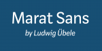
Marat Sans Font

Lively and clean, this is what Marat Sans is about at a glance. It is a sans serif font which was created by the person named Ludwig Ubele. It is characterized by utmost legibility insofar as the typeface is concerned and with a wide variety of typography for use and consumption. This particular font family has included 7 styles and weights plus different innovative elements including arrows, sensitive forms, inferiors and superiors, language features, alternate glyphs, fractions and numerals. It is perfect when for the body of your blog or the description of your media elements for your website. It is likewise pleasing to the eyes when used as a headline of your contents or blog entries. It is also a perfect choice for taglines of your brand or product campaign or even the textual forms of your posters and flyers. Adding to that, it is a good choice for minimalist-themed ads as it will execute the words you want to communicate. You can use it should you want to play with colors, textual effects i.e. highlights, outlines, shadows, etc. to add creativity to your work.

Indeed, there are a lot magic that you can use with the Marat Sans font—one that will surely benefit the commercial agenda you have in mind.

Download Marat Sans Font